
As an Amazon Associate, I earn from qualifying purchases. This means I may earn a commission if you purchase through links on this page — at no extra cost to you.
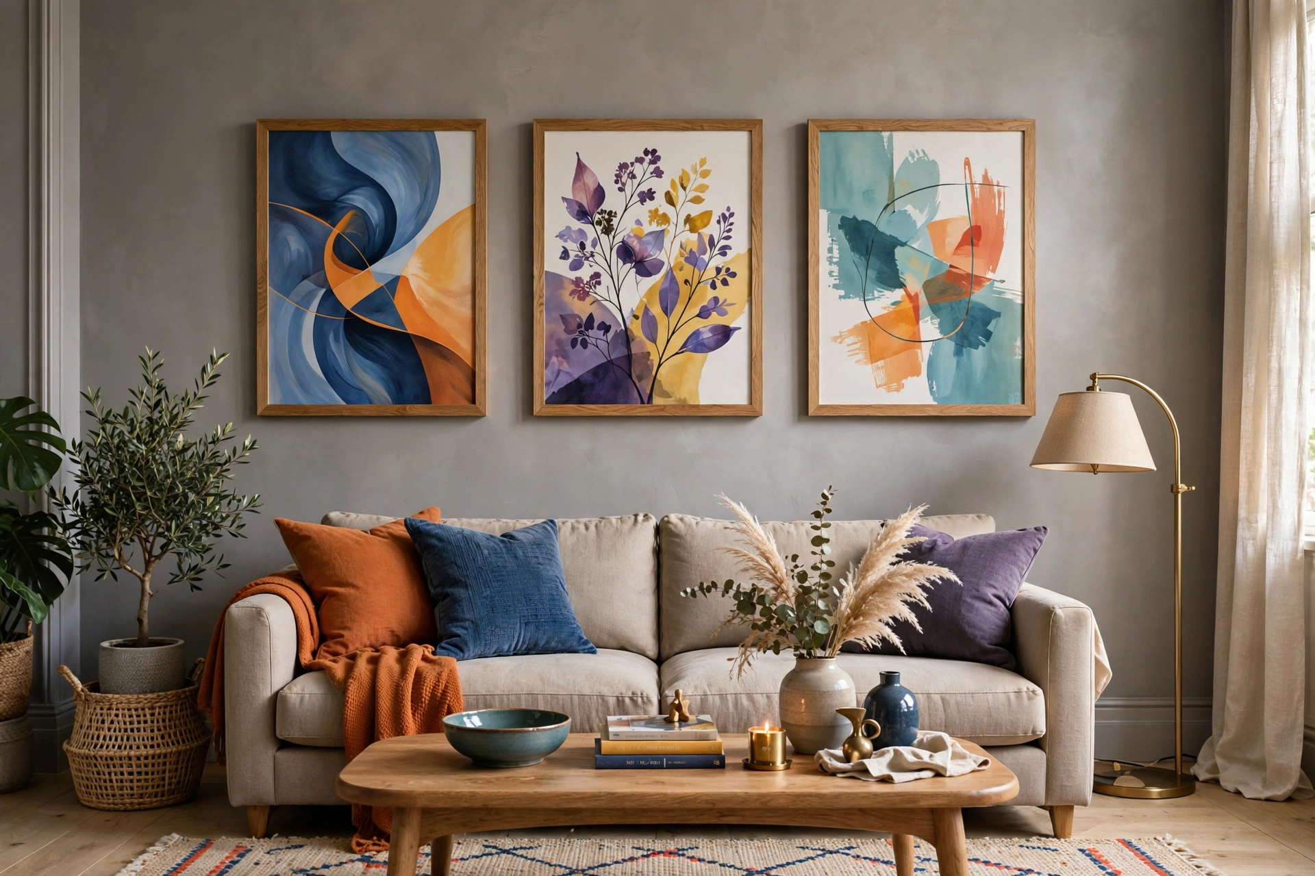
The best wall art colors for grey walls are mustard yellow and teal (for contrast and energy), blush pink and sage green (for soft sophistication), black and white (for timeless elegance), and warm metallics like gold and copper (for luxury). Grey is a neutral canvas â almost any color works, so choose based on the mood you want.
By Mood
Energetic & Bold
Mustard yellow, coral, teal, emerald green. These pop against grey and create focal points.
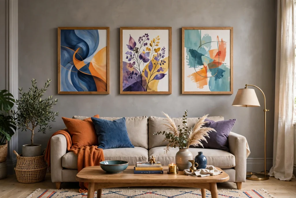
Canvas Wall Art Abstract Large Wall Decor, Framed Pictures, Yellow Teal Artwork (Iridesart)
Best for energetic yellow-and-teal contrast on grey walls.
Calm & Sophisticated
Blush pink, sage green, soft blue, lavender. Muted tones that harmonize with grey’s coolness.

Best for a calm, sophisticated look on grey walls.
Timeless & Classic
Black and white photography, charcoal sketches, sepia tones. Never clashes, always elegant.

Large Framed Black and White Abstract Wall Art for Living Room, 3 Piece (Cuspin)
Best for timeless black-and-white elegance on grey walls.
Luxurious & Warm
Gold, copper, bronze metallics. Warm metals contrast beautifully with cool grey.
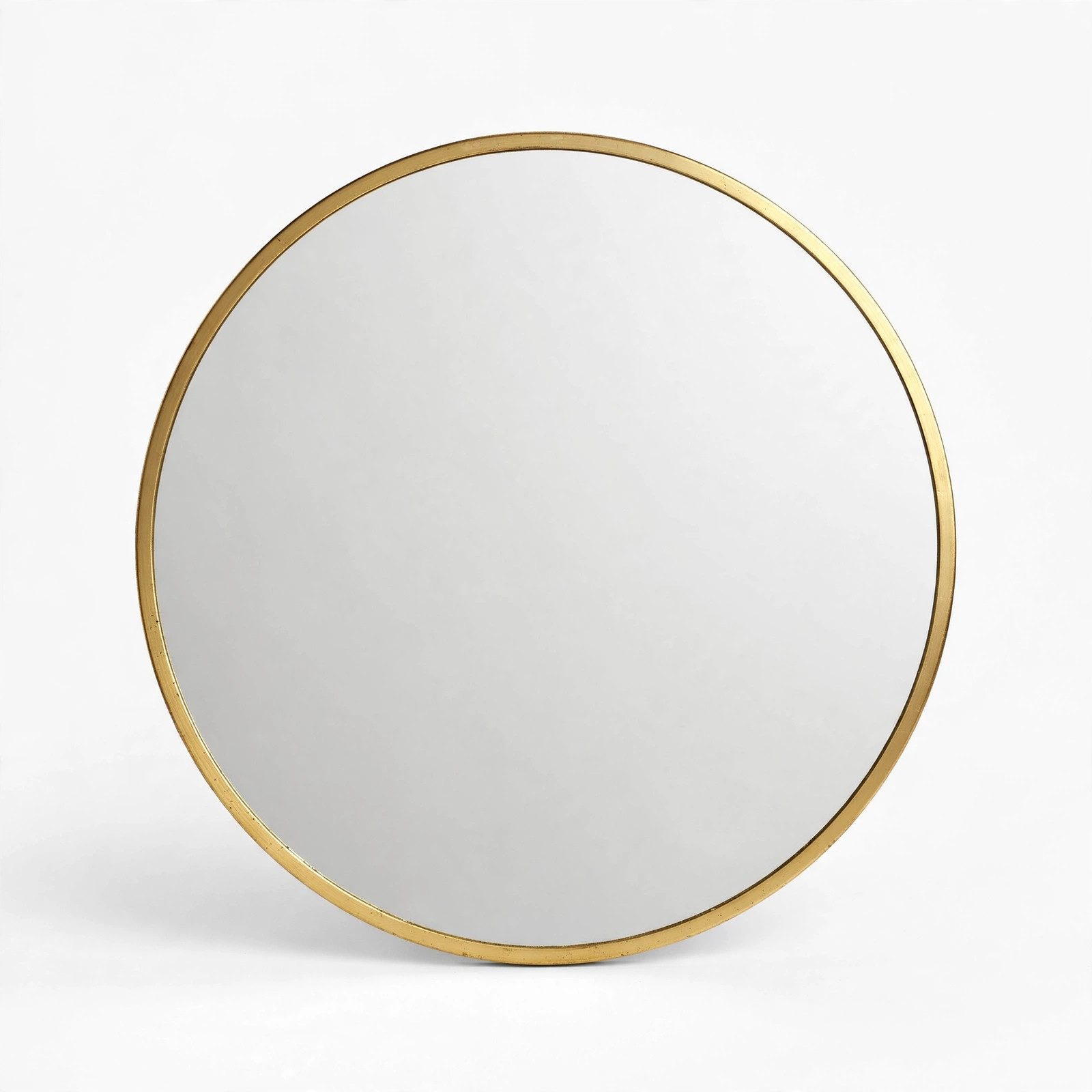
ZIYOO Vintage Baroque Round Wall Mirror 24″x24″, Gold Ornate Carved Frame
Best for a luxurious, warm metallic accent on grey walls.
What to Avoid
Very light grey art on light grey walls (disappears). Muddy browns (can look dingy). Too many competing bright colors (chaotic).
Pro Tip
Consider your grey’s undertone. Blue-grey walls pair best with cool art colors (blues, greens, purples). Warm greige walls work better with warm art (yellows, oranges, reds).
How to Read Your Grey’s Undertone (This Changes Everything)
Not all greys are the same, and the undertone is what determines which art colors will sing and which will clash. To find your undertone, hold a pure white piece of paper against the wall in daylight. If the grey looks bluish or purplish next to the white, it’s a cool grey. If it looks yellowish, beige, or pinkish, it’s a warm grey (greige). If it looks purely neutral, you’ve got a true grey — the most forgiving kind.
Cool greys (blue or violet undertones) pair best with cool art colors: blues, teals, greens, purples, and black-and-white photography. Warm art colors can work as deliberate contrast — a mustard yellow piece against blue-grey walls is striking — but use them as accents, not the dominant note. Warm greys (yellow or beige undertones) flip the script: they harmonize with warm art (terracotta, gold, warm reds, creamy whites) and make cool colors pop as accents. True greys genuinely go with everything, which is why they’re the most popular choice — but they can also feel flat, so art with strong color or texture does the heavy lifting in a true-grey room.
Art Size and Placement Rules for Grey Walls
Grey walls are a gallery-like backdrop, which means sizing mistakes show more. The most common error is hanging art that’s too small — a lonely 8-by-10 print on a big grey wall looks lost and makes the wall feel emptier. As a rule, art above a sofa or console should span roughly two-thirds the width of the furniture below it. In general, bigger reads better on grey: the neutral background can handle large-scale pieces without feeling busy.
For placement, hang the center of the piece at about 57 inches from the floor — museum standard, and it works because it puts art at average eye level. Above furniture, leave 6–8 inches between the top of the furniture and the bottom of the frame. If you’re creating a gallery wall on grey, lay the arrangement on the floor first and photograph it — grey walls show spacing inconsistencies clearly, so consistent 2–3 inch gaps between frames matter more here than on patterned wallpaper. And consider leaning large pieces against the wall on a console or mantel instead of hanging them; the casual lean looks intentional and lets you rotate art seasonally.
Frame Colors That Work With Grey Walls
The frame is the bridge between your art and your wall, and on grey walls the choice matters. Black frames are the safest, most versatile option — they define the art crisply against any grey and suit photography, prints, and abstract work alike. White frames create a softer, airier feel and work beautifully with light, minimal art on mid-tone grey; they can disappear against very light grey walls, so save them for medium and dark greys.
Natural wood frames add warmth that grey walls often need — light oak for Scandinavian feels, walnut for richness against cool greys. Gold and brass frames bring luxury and look stunning against charcoal or slate grey, especially with traditional or botanical art. Avoid grey frames on grey walls unless the tones contrast deliberately; a mid-grey frame on a mid-grey wall just looks muddy. When in doubt, match your frame to another element in the room — black frames echo black hardware, wood frames echo wood furniture — and the whole space ties together.
Pairing Art With Grey by Decor Style
Scandinavian: Black-and-white photography, minimal line art, and muted botanical prints in thin black or oak frames. Keep the palette restrained — the grey wall is already doing the quiet work. Industrial: Large-scale abstract pieces, architectural photography, or metal wall sculptures. Black frames, oversized formats, and art with texture (concrete-look canvases, mixed media) suit the raw aesthetic. Modern glam: This is where metallics shine — gold-framed mirrors, art with gold leaf details, high-contrast black-and-white pieces. Charcoal grey walls with gold accents are a classic glam combination.
Farmhouse: Warm up grey walls with landscape prints, vintage-style botanical illustrations, or typography art in distressed wood frames. The grey keeps it current; the warm art keeps it cozy. Boho: Layer textile wall hangings, macramé, and colorful global-inspired prints. Grey walls are the perfect calm backdrop for boho’s joyful clutter — the neutral background keeps the mix from feeling chaotic. Traditional: Oil-style landscapes, classic portraits, or gilt-framed mirrors. Grey walls modernize traditional art beautifully, giving classic pieces a fresh, gallery-like setting.
Grey Wall Art FAQs
Can I hang colorful art on grey walls? Absolutely — grey is a neutral, so it supports any color. The question is mood, not permission. Vibrant art energizes a grey room; muted art keeps it serene. Both are valid; just be intentional.
What about a gallery wall on grey? Grey walls are ideal for gallery walls because the neutral background unifies mixed frames and styles. Use a consistent frame color to keep it cohesive, and include one or two larger anchor pieces so the arrangement has structure.
Should art match my grey sofa or rug? It doesn’t need to match, but it should relate. Pull one color from the art into a throw pillow or vice versa. The goal is a room that feels connected, not a room where everything is the same shade of grey.
Creating a Gallery Wall on Grey Walls: Step by Step
Grey walls are the ideal gallery wall backdrop — the neutral background unifies mixed pieces the way a white mat unifies a frame. Here’s a method that works: 1. Gather and audit. Collect everything you’re considering, then edit ruthlessly. A gallery wall needs a unifying thread — consistent frame color, a shared palette, or a common subject. The thread is what separates “curated” from “random.”
2. Plan on the floor first. Lay the arrangement on the floor or a large table, experimenting with spacing. Start with your largest piece slightly off-center (dead-center arrangements feel static), then build outward. Keep gaps consistent — 2 to 3 inches between frames. Photograph each iteration; the camera reveals imbalances your eyes miss. 3. Transfer to the wall with paper templates. Trace each frame on kraft paper, cut out the templates, and tape them to the wall with painter’s tape. Live with the paper layout for a day — walk past it, view it from the doorway, check it in evening light. Moving paper is free; moving nail holes is not.
4. Hang from the center out. Start with your anchor piece, get it level, then work outward using your templates. For grey walls specifically, black or natural wood frames with consistent spacing look sharpest; mixed metallics can work but demand more careful editing. 5. Include breathing room. The most common gallery wall mistake is filling every inch. Negative space — sections of bare grey wall — is what makes the arrangement feel like a gallery rather than a collage. If in doubt, remove one piece.
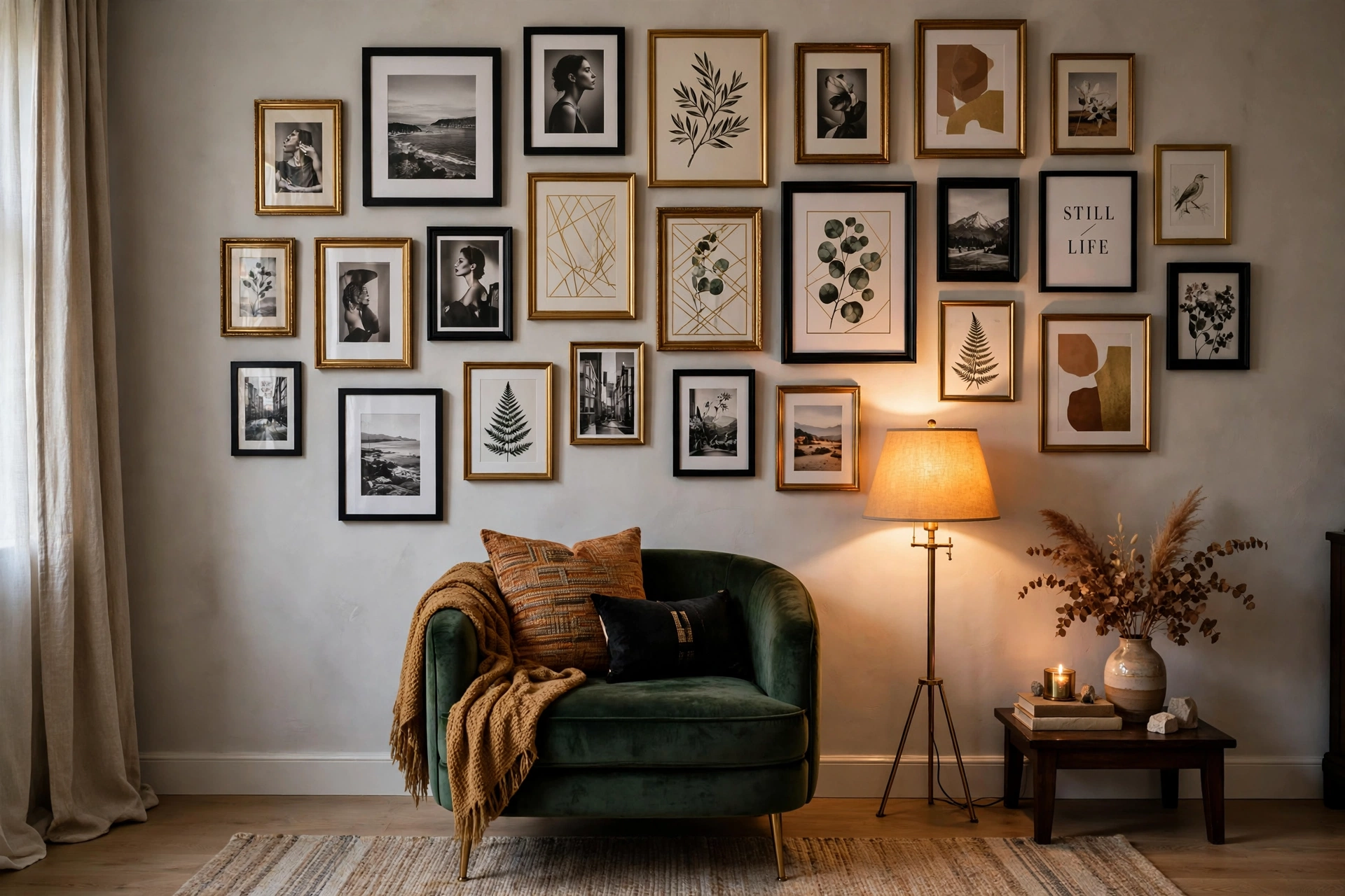
SONGMICS Picture Frames, 10 Pack Collage Picture Frames (Two 8×10, Four 5×7, Four 4×6), Black
Best for building a cohesive gallery wall on grey walls with consistent black frames.
Lighting Your Art on Grey Walls
Art lighting transforms how art looks on grey walls, especially in the evening when overhead lighting flattens everything. Picture lights — the slim bars mounted above frames — are the classic solution, casting a warm wash down across the art. Hardwired versions look best but need an electrician; battery-powered LED picture lights are a renter-friendly alternative with surprisingly good color rendering. Adjustable spotlights on a track or as recessed ceiling lights let you aim light precisely at each piece — the museum approach, and the most flattering for large art.

Best for lighting art on grey walls with a warm wash, without hardwiring.
Whatever you choose, mind the color temperature: warm light (2700–3000K) makes art feel rich and inviting on grey walls; cool light can make both the art and the grey feel clinical. Avoid placing art where it catches direct glare from windows — UV glazing helps with fading, but glare still ruins viewing. And if you’re lighting a gallery wall, one wide wash of light across the whole arrangement usually looks better than a spotlight per frame — fewer fixtures, calmer effect.
Rotating Art Seasonally
One underused advantage of grey walls: they’re the perfect neutral stage for rotating art through the year. Because grey goes with everything, you can swap pieces seasonally without repainting or rethinking the room. Keep a small rotation — two or three alternate pieces stored flat or in a portfolio — and change them with the seasons: botanical prints and light landscapes for spring and summer, moody abstracts and rich photography for fall and winter.
Picture ledges make rotation effortless — just swap what’s leaning on the shelf, no new holes required. Even simpler: keep the frames constant and swap only the prints inside. A set of inexpensive frames in your chosen finish becomes a permanent installation; the art inside changes whenever you like. This is also the budget-friendly way to enjoy expensive-looking variety: ten printable art files and two good frames give you endless combinations for the cost of one framed piece.
🛒 Shop This Look:
🛒 Shop This Look:
🛒 Shop This Look:



