
As an Amazon Associate, I earn from qualifying purchases. This means I may earn a commission if you purchase through links on this page — at no extra cost to you.
By Ella Knight
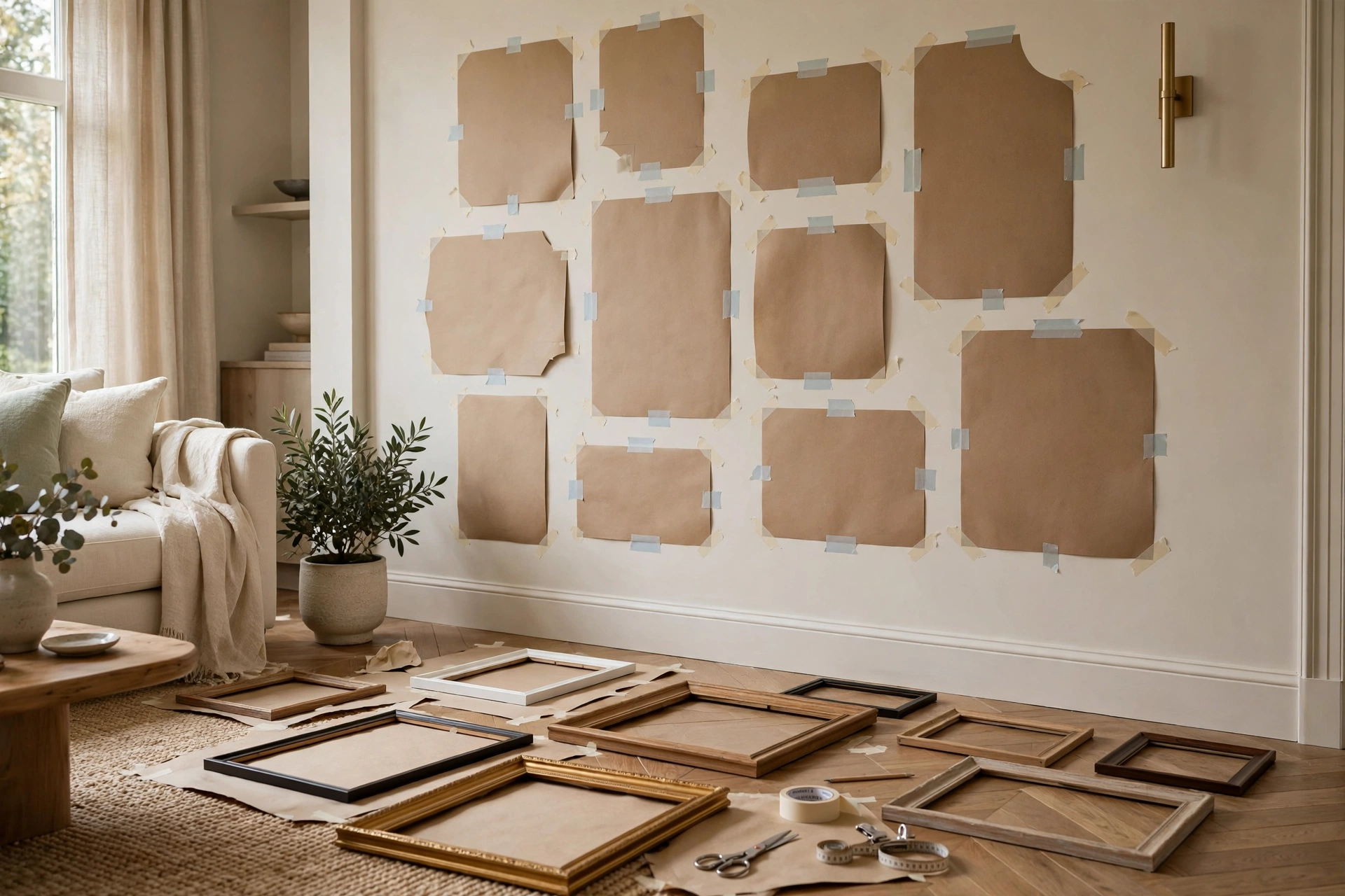
To plan a gallery wall layout on the floor, arrange all your frames face-up on a large flat surface, starting with the biggest piece in the center. Adjust spacing to 2-3 inches between frames, step back to assess balance, then trace each frame on kraft paper, cut out the shapes, tape them to the wall, and hang following your paper template.
What You’ll Need
- All frames you plan to hang
- Kraft paper or newspaper
- Pencil and scissors
- Painter’s tape
- Measuring tape
Step 1: Lay It All Out
Clear a large floor area — bigger than your wall space if possible. Place all frames face-up. Start with your largest piece roughly in the center.
Step 2: Build Outward
Add the next-largest pieces around your anchor. Fill gaps with smaller frames. Aim for 2-3 inches between each frame. Don’t worry about perfection yet — you’re just getting a feel for the composition.
Step 3: Check Balance
Step back (or stand on a chair and look down). Does one side feel heavier? Shift pieces until the visual weight feels even. Remember: visual weight isn’t just size — dark colors and busy patterns feel “heavier” than light, simple ones.
Step 4: Make Paper Templates
Trace each frame on kraft paper and cut out the shapes. Mark where the hanging hardware sits on the back of each frame — transfer this mark to the paper template.
Step 5: Tape to the Wall
Tape the paper templates to your wall using painter’s tape. Live with it for a few hours or overnight. You’ll notice spacing issues you missed on the floor.
Step 6: Hang
Hammer nails through the marked hardware points on each paper template. Hang the frame, then tear away the paper. Work from the center outward.
Pro Tips
- Photograph your floor layout before making templates — useful reference
- Number the back of each frame and its template to avoid confusion
- For heavy frames, locate studs before you start
Choosing Your Anchor Piece
Every strong gallery wall has an anchor — the one piece the eye lands on first, around which everything else orbits. Usually it’s the largest frame, but size alone doesn’t make an anchor. The best anchor piece has visual gravity: bold color, high contrast, an arresting image, or personal significance that makes it the emotional center of the display.
🛒 Shop This Look:
Size-wise, your anchor should be noticeably larger than the other pieces — roughly 1.5 to 2 times the area of your average frame. In a wall of 8×10s, a 16×20 anchor provides that hierarchy. Without a clear size leader, arrangements tend to feel flat, with the eye skittering across the wall instead of landing somewhere satisfying.
Placement matters as much as selection. The anchor typically sits at or near the center of the arrangement, at eye level — centered around 57 inches from the floor. In asymmetrical layouts, placing the anchor slightly off-center (following the rule of thirds) creates a more dynamic, designer feel. Above a sofa or console, center the anchor on the furniture, not on the wall — the furniture is the visual reference point.
If you don’t own an obvious anchor yet, that’s fine — plan the wall around the gap. Leave the center position for a future find, and build the supporting pieces around it. Some of the best gallery walls started with an empty center that waited months for the right piece. Alternatively, create an anchor from what you have: a cluster of four small matching frames hung tight together reads as one large anchor piece.
Composition Rules That Make Layouts Work
Good gallery walls look effortless but obey quiet rules. The most useful is visual weight balance: dark colors, large sizes, and busy patterns all feel “heavy,” while light colors, small sizes, and simple images feel “light.” Distribute heaviness evenly — if your anchor is a big dark print on the left, balance it with two or three medium pieces on the right, not with one tiny frame that gets visually crushed.
Odd numbers are your friend. Arrangements of 3, 5, or 7 pieces feel more natural than even groupings, which the eye tends to split into pairs. This matters most in small clusters; in a large salon wall the overall count matters less than local groupings.
Think in triangles. The eye loves implied triangular relationships between pieces — position three related items (same color, same subject, same frame) so they form a loose triangle across the arrangement. This creates visual pathways that make the wall feel connected rather than scattered. Professional curators use this constantly, and once you see it, you’ll spot it in every gallery you admire.
Repeat with variation. Pick two or three unifying threads — say, black frames and a blue-and-white palette — and repeat them throughout, but vary everything else. Repetition creates cohesion; variation creates interest. A wall where every frame is identical is a grid, not a gallery; a wall with no repetition at all is a jumble. The sweet spot is “clearly related, never matching.”
Finally, respect the edges. The outer boundary of your arrangement should form a loose, roughly coherent shape — a soft rectangle, an oval, an organic blob. Pieces jutting far beyond the implied boundary look like mistakes. When you’re arranging on the floor, squint at the overall silhouette; if one frame sticks out awkwardly, tuck it in or remove it.
Common Floor-Planning Problems (and Fixes)
Problem: You don’t have enough pieces. The floor layout looks sparse and sad. Fix: don’t force it — hang what you have as a starter cluster and plan to grow. Or bulk up affordably: add a mirror (counts as a piece and adds light), frame a piece of attractive wrapping paper or fabric, or include an empty frame as a sculptural element. A 5-piece wall hung well beats a 12-piece wall padded with filler.
Problem: You have too many pieces. The floor is crowded and nothing stands out. Fix: edit ruthlessly before you hang. Remove the weakest third — the pieces you’d be slightly embarrassed to explain. Save them for another room or a future rotation. Remember that negative space between frames is part of the design; cramming every piece you own onto one wall is how gallery walls become clutter walls.
🛒 Shop This Look:
Problem: The wall has obstacles. Light switches, thermostats, and vents break up the space. Fix: treat obstacles as design constraints, not dealbreakers. Build the arrangement around them — a thermostat can sit inside a gap between frames and virtually disappear. For light switches, keep at least a couple of inches of clearance so plates remain accessible, and avoid hanging anything that blocks a vent’s airflow.
Problem: Furniture dictates the layout. The sofa is off-center, or a tall bookshelf eats half the wall. Fix: align your gallery to the furniture, not the wall’s geometric center. Center the arrangement over the sofa even if the sofa isn’t centered on the wall — the furniture grouping is what the eye reads as the composition’s base. For a tall bookshelf, treat the remaining wall as its own canvas and build a vertical arrangement in the leftover space.
Problem: It looked great on the floor but wrong on the wall. This happens because floors and walls read differently — you’re viewing from above versus straight on, and wall scale always feels bigger. Fix: this is exactly what the paper template stage is for. Transfer to templates, tape them up, and live with it for a day. The template stage catches the problems the floor stage misses, which is why professionals never skip it.
From Floor to Wall: Transferring Without Tears
The floor layout is the fun part; the transfer to the wall is where gallery walls are won or lost. The paper template method exists precisely for this step, and a few refinements make it nearly foolproof.
First, upgrade your template material. Kraft paper or rosin paper from the paint section works far better than newspaper — it’s sturdier, doesn’t tear when you reposition it, and you can write on it clearly. Trace each frame, then cut the shape out with an extra inch of margin you fold back — no, cut exactly to the frame’s outline. Precision here pays off: a sloppy template produces a sloppy hang.
Second, mark the hardware point on every template before it goes near the wall. Flip each frame over, measure from the top of the frame down to where the nail or hook will catch (the top of the sawtooth hanger, or the apex of the wire when pulled taut), and transfer that exact measurement to the paper. This is the step most people skip, and it’s the difference between “hang and adjust” and “hang and done.” When you hammer through the marked point, the frame lands exactly where the template was.
Third, number everything. Write a number on the back of each frame and the same number on its template. When you have nine similar black frames, you will not remember which template belongs to which — and hanging the wrong frame in a template’s spot throws off every measurement you carefully transferred.
Fourth, photograph the wall of templates before you hang a single frame. If a template tears or falls, the photo is your backup. It also lets you do the phone-screen test one final time: imbalances invisible in person often reveal themselves in a photo.
Finally, hang from the center outward, removing each template as you go. Hammer the nail through the marked hardware point, hang the frame, then tear the paper away. Working outward from the anchor keeps the composition’s center locked while the edges flex. And keep your level handy — check the anchor frame after hanging, because everything else references it. A level anchor with slightly imperfect followers still looks intentional; a crooked anchor makes the whole wall feel wrong.
🛒 Shop This Look:




1 thought on “How to Plan a Gallery Wall Layout on the Floor First”
Comments are closed.