
As an Amazon Associate, I earn from qualifying purchases. This means I may earn a commission if you purchase through links on this page — at no extra cost to you.
Walking through a home where each room is a jarring, disconnected color feels chaotic. The secret to a cohesive home is choosing paint colors that flow — distinct enough that rooms feel individual, but related enough that transitions feel natural. Here’s a step-by-step method for building a whole-house palette that works.
Step 1: Choose Your Main Neutral
Pick one versatile neutral for your main living areas — the spaces that connect everything (hallways, living room, open-plan areas). Good candidates: warm white (White Dove), light greige (Agreeable Gray), or soft beige (Accessible Beige). This color should have an LRV of 60+ to keep things bright and an undertone that works with your fixed elements (flooring, countertops).
Step 2: Identify Your Undertone Family
Stick to one undertone family throughout. If your main neutral is warm, choose warm shades for other rooms. Mixing warm and cool undertones between adjacent rooms creates visual discord even when the colors look fine individually. When in doubt, compare swatches side by side — the odd one out will be obvious.
Step 3: Vary Depth, Not Hue
The easiest flow trick: use the same color family at different depths. Paint the living room in a light greige, the bedroom in a medium greige, and the bathroom in a deeper greige. Same undertone, varying intensity. This creates subtle distinction while maintaining perfect harmony. Most paint brands offer color strips showing 4-7 shades of the same hue — use them.
Step 4: Add Personality in Contained Spaces
Powder rooms, laundry rooms, home offices, and kids’ bedrooms are ideal for bolder color. Because these rooms have doors (visual separation), you can go bolder without disrupting flow. A deep green powder room off a neutral hallway feels like a delightful surprise, not a clash.
🛒 Shop This Look:
Step 5: Connect With Repeating Accents
Repeat 2-3 accent colors throughout the house in decor (not wall paint). If your bedroom has sage walls, echo sage in living room pillows or kitchen accessories. This subconscious repetition ties rooms together even when wall colors differ.
Common Flow Mistakes
Too many different colors: More than 4-5 distinct wall colors in a small home feels chaotic. Edit ruthlessly.
Ignoring sight lines: Stand in each room and note what you see through doorways. Those visible walls must coordinate.
Forgetting the ceiling: Bright white ceilings in every room create continuity even when wall colors change. Don’t paint ceilings different colors room to room.
Sample Flowing Palettes
Warm & Cozy: Alabaster (main) → Accessible Beige (bedroom) → Evergreen Fog (powder room accent)
Fresh & Airy: Simply White (main) → Sea Salt (bedroom) → Hale Navy (office accent)
Modern Neutral: Agreeable Gray (main) → Repose Gray (bathroom) → Iron Ore (dining accent)
The Whole-House Palette Method
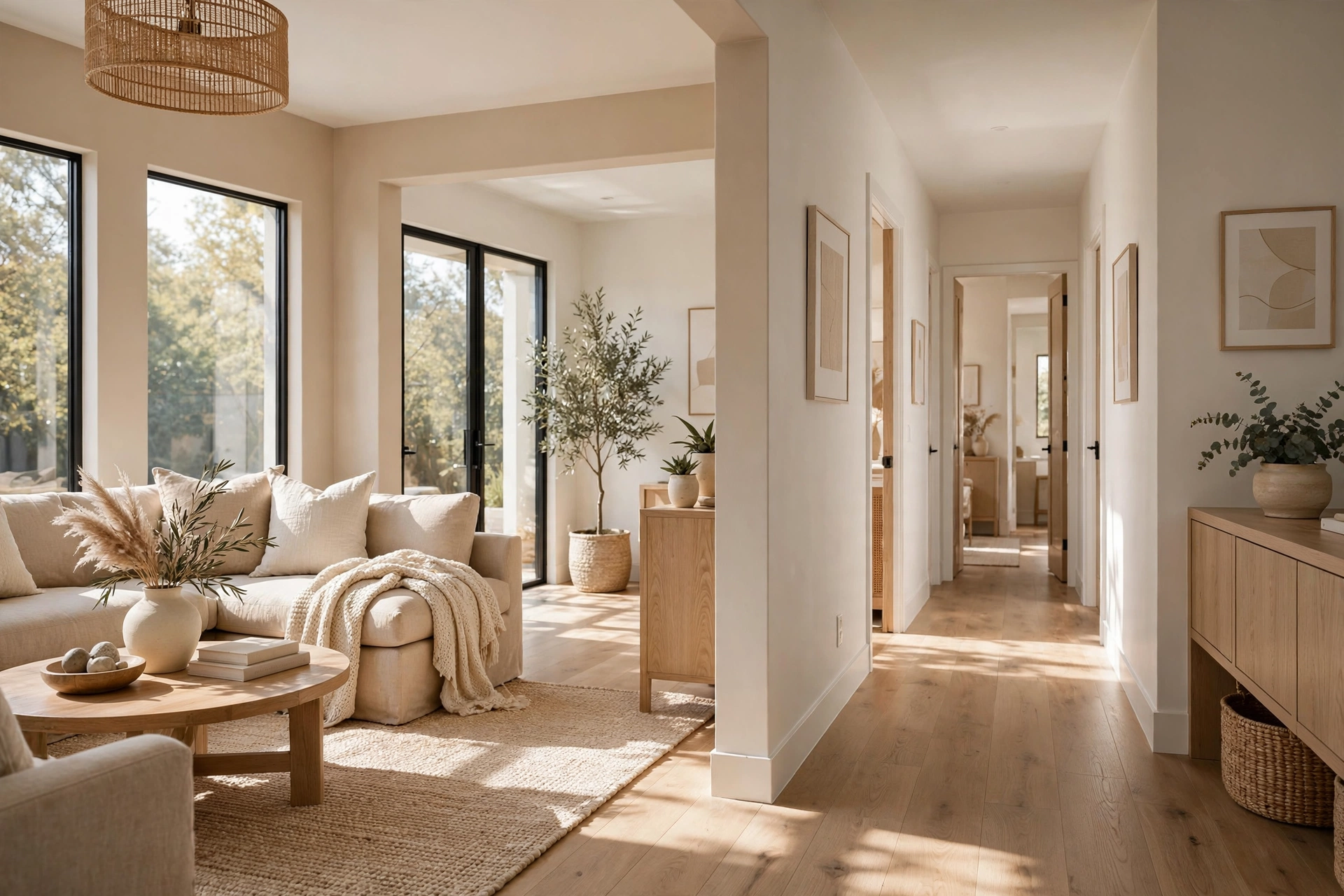
Instead of choosing room colors one at a time (which is how disconnected homes happen), build a whole-house palette first: one main neutral, two to three supporting colors, and one or two accents. The main neutral appears in the most connected spaces — hallways, open living areas, foyers — creating the continuous backdrop. Supporting colors go in individual rooms (bedrooms, offices, dining rooms), each distinct but sharing the main neutral’s undertone family. Accents appear in small doses everywhere: a powder room, the inside of a bookshelf, a front door.
A concrete example: main neutral of warm white (walls in living room, hallway, kitchen); supporting colors of sage green (bedroom), warm greige (home office), and soft terracotta (dining room) — all sharing warm undertones; accents of deep forest green (powder room) and navy (front door). Every room feels individual, yet nothing clashes because the undertone family is consistent. Write the palette down — literally, on a card you keep with paint chips — and check every future color decision against it. The palette is a constraint that makes decisions easier, not harder: if a color doesn’t fit the palette, it’s out, no agonizing required.
Transitions: Doorways, Hallways, and Sight Lines
Color flow breaks down most often at transitions — the places where one color meets another. The rule: every color change needs an architectural break. Inside a doorway, the color should change at the middle of the door frame (paint the door jamb’s inner edge to match one side). In an open archway or cased opening without a door, change colors at the inside corner or the center of the opening — never mid-wall. Painting a color change in the middle of a flat wall looks like a mistake; at an inside corner it looks like architecture.
Hallways deserve special attention because they connect everything and are seen from every room. The safest hallway choice is your main neutral — it becomes the visual “reset” between more colorful rooms. If your hallway is long and dark, a light-to-mid tone neutral keeps it from feeling like a tunnel; save deeper colors for rooms with natural light. Sight lines are the advanced consideration: stand in your main living space and note every wall color visible simultaneously. Those colors must harmonize as a group, even if the rooms are separate — because visually, from that spot, they’re one composition. This is why open-concept homes need the most disciplined palettes: there are no doors to hide behind.
🛒 Shop This Look:
Testing Flow Before You Commit
Testing individual colors is standard advice; testing flow is the step most people skip. Here’s how: paint large sample boards (foam core or poster board, at least 2×2 feet) of each color in your planned palette. Place them in their intended rooms, then walk your home’s natural path — front door through living spaces to bedrooms — looking at each board in sequence as you’d experience the finished rooms. Photograph the sequence. Problems reveal themselves immediately: the bedroom color that looked lovely alone may clash violently with the hallway color visible through its doorway.
Test at two times of day minimum: midday and evening under artificial light. Colors that flow beautifully in daylight can fight under warm lamplight if their undertones diverge. Pay special attention to the undertone consistency across your palette — this is where flow usually fails. Two rooms can be different colors entirely (sage and terracotta, say) and still flow if both are warm; two rooms in nearly identical grays can clash if one leans blue and the other leans green. When a combination fails the walk-through test, adjust the undertone first and the color second — it’s almost always the undertone that’s wrong, not the hue.
Flow for Open-Concept Spaces: Special Rules
Open-concept areas (combined kitchen/living/dining) need stricter discipline because there are no walls to separate colors. The approach that works: one wall color for the entire open area, with differentiation coming from furnishings, rugs, and art rather than paint. This isn’t a lack of creativity — it’s what makes open spaces feel expansive instead of choppy. The single color should be a versatile neutral in the light-to-mid range that flatters both kitchen cabinetry and living room upholstery.
Where you can introduce variation in open plans: the ceiling (a shade lighter than walls, or a soft contrast in a dining zone), an architectural feature (a fireplace wall, a kitchen island in a contrasting color, built-in shelving painted as an accent), and adjacent enclosed rooms visible through wide openings (a powder room or study in a deeper tone, glimpsed through the opening, adds depth without breaking flow). The test for any open-plan color move: squint at the space. If the color blocks resolve into a calm composition with one dominant tone, you’re good. If it looks patchy, simplify.
Ceilings, Trim, and the “Fifth Wall”
Color flow discussions usually stop at walls, but ceilings and trim are part of every room’s color composition — and the default choices aren’t always right. The standard (ceiling a shade lighter than walls, trim bright white) works because it’s invisible: it gets out of the way. But in a whole-house palette, these defaults deserve the same intentionality as wall colors. Tinted ceilings — the wall color at 50% strength, or a warm white matched to the palette’s undertone — eliminate the stark white “lid” that can make colored walls feel disconnected. This is especially effective in rooms with deep or saturated wall colors, where a bright white ceiling creates a jarring contrast line.
Trim color should relate to your palette, not default to the brightest white available. In warm palettes, a soft warm white trim (rather than blue-white) harmonizes beautifully; in cool palettes, a crisp clean white. For a sophisticated look gaining popularity: trim painted the same color as the walls (in satin finish for subtle contrast) — this color-drenching approach makes rooms feel larger and more cohesive, eliminates the choppy trim outlines, and looks custom. It works best in rooms with architectural trim worth showing off paradoxically — the trim’s shadows still define it, just tonally. Whatever you choose, keep ceiling and trim consistent across the whole house — they’re the continuous thread running through every room, and consistency here does more for flow than any wall color choice. When buyers and guests say a home “flows,” they’re often responding to this invisible continuity without realizing it.
🛒 Shop This Look:



