
As an Amazon Associate, I earn from qualifying purchases. This means I may earn a commission if you purchase through links on this page — at no extra cost to you.
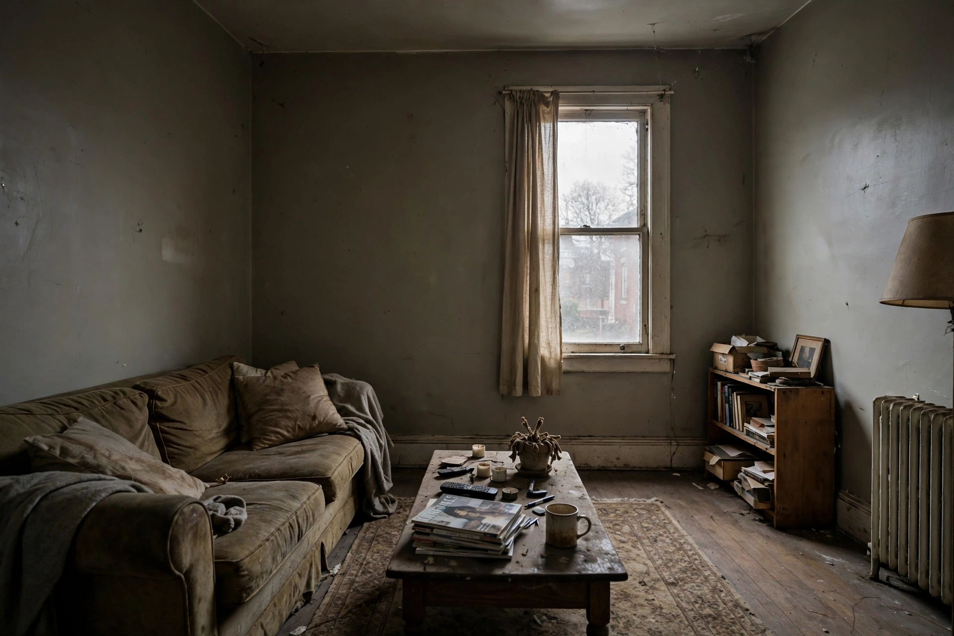
Some rooms just feel… off. Not dirty, not cluttered — just dingy, dull, or lifeless. More often than not, the paint color is the culprit. These seven common color mistakes drain the life from rooms, and each one has a straightforward fix. Related: Should I Paint My Front Door in 2026.
Mistake 1: Choosing Colors That Are Too Dark for the Light
A rich navy looks stunning in a sun-drenched showroom but turns muddy and oppressive in a north-facing bedroom with one small window. Fix: Match color depth to available light. Dark rooms need colors with LRV 55+. Save deep tones for well-lit spaces or single accent walls. Related: Free Paint Color Visualizer: See Colors on Your Walls.
Mistake 2: Ignoring Undertones
That “warm greige” that looked perfect on the swatch? On your wall it’s unmistakably pink. Undertones amplify at scale. Fix: Always compare swatches against each other and against your fixed elements (flooring, tile). Test on the wall before committing.
Mistake 3: Using Flat Paint in High-Traffic Areas
Flat paint shows every scuff, fingerprint, and smudge. In hallways, kids’ rooms, and entryways, walls quickly look grimy even when the color is fine. Fix: Use eggshell minimum in living areas, satin in kitchens and baths. The slight sheen is much more forgiving.
Mistake 4: Painting Everything the Same Stark White
White-on-white-on-white can feel clean, but in rooms with limited natural light it often reads as flat, cold, and institutional rather than bright. Fix: Use warm whites (not blue-whites), add texture through textiles and wood, and ensure adequate warm artificial lighting.
Mistake 5: Clashing With Fixed Elements
Pink-beige tile + gray walls. Orange-toned wood floors + cool blue walls. When wall color fights the undertones of permanent fixtures, everything looks wrong. Fix: Identify the undertones of your flooring, countertops, and tile first, then choose wall colors in the same undertone family.
Mistake 6: Too Many Different Colors
Five different wall colors in a 1,200 sq ft home creates visual chaos. Each room feels disconnected, and the overall impression is busy rather than designed. Fix: Limit to 3-4 colors maximum. Use one main neutral throughout, with variation in depth rather than hue.
Mistake 7: Forgetting About Artificial Light
That perfect greige looks amazing at noon but turns greenish-gray under your cool LED bulbs at night. Most of us experience our homes primarily in artificial light. Fix: Evaluate test swatches under your actual evening lighting. Consider switching to warm-white bulbs (2700-3000K) which are more flattering to most paint colors.
Why Swatches Lie: How Color Changes in Real Rooms
A paint chip is two inches wide, viewed under store lighting, surrounded by other chips. Your wall is hundreds of square feet, lit by your windows and your bulbs, surrounded by your furniture. Those differences explain why a color that looked perfect in the store can feel completely wrong at home. Understanding the three forces that transform color between swatch and wall will save you from most mistakes before they happen.
Scale amplifies everything. Color intensifies as it covers more area. A beige that looks neutral on a tiny chip reads noticeably warmer — sometimes almost peachy — across an entire wall. A gray that seems barely-there on the card can feel like a statement once it wraps a room. This is why professionals always test with large samples: the bigger the test area, the closer it matches the final result.
🛒 Shop This Look:
Light rewrites color throughout the day. Morning light is cool and blue-toned, midday light is the most neutral, and late-afternoon sun is warm and golden. A north-facing room gets cool, indirect light all day, which pushes colors toward blue and gray. South-facing rooms get warm, intense light that enriches warm colors and can wash out pale ones. Your paint color is not one color — it is a different color at 8 a.m., 2 p.m., and 9 p.m.
Surroundings shift perception. The same white looks creamy next to a cool gray sofa and stark next to warm wood floors. Colors are never perceived in isolation; your eye constantly compares. This is why comparing swatches against your fixed elements — flooring, countertops, tile, trim — matters more than comparing them against each other.
The 48-Hour Swatch Test That Prevents Most Regrets
Professional designers rarely commit to a color without a multi-day test, and the process is simple enough for anyone to follow:
- Buy sample pots, not just chips. Paint chips are useful for narrowing a field of twenty options down to three. For the final decision, buy small sample pots of your finalists and paint them on the wall.
- Paint large test areas. Apply each sample in a patch at least 2 feet by 2 feet — bigger is better. Small dabs next to each other create optical interference that makes judgment harder, not easier.
- Test on at least two walls. Paint each candidate on the wall it will actually live on, plus one wall with different light exposure. A color that works on a sunlit wall may fail on the shadowed one.
- Leave white space between samples. Paint each test patch with a border of unpainted wall (or white primer) around it so the colors do not contaminate each other visually.
- Observe across two full days. Check the patches in morning, midday, and evening light, and under your normal artificial lighting at night. Take phone photos at each stage — photos reveal shifts your eyes adapt to and miss.
- Live with the finalists, then decide once. After 48 hours, one option usually pulls ahead clearly. Trust the sustained observation over your first impression.
This process costs a few dollars in sample pots and takes almost no active time. Compared to repainting a whole room, it is the cheapest insurance in home improvement.
Understanding LRV: The One Number That Predicts How a Color Behaves
LRV — Light Reflectance Value — is printed on the back of most paint chips and listed on manufacturer websites. It measures how much light a color reflects, on a scale from 0 (absolute black) to 100 (pure white). Learning to read this single number removes most of the guesswork from choosing colors for different rooms.
The practical ranges: Colors with LRV above 70 are bright and reflective — safe bets for dark rooms and small spaces. LRV 55–70 covers most popular mid-tone neutrals; these work in average rooms with decent light. LRV 35–55 is the medium-dark zone where rooms need good natural light to avoid feeling heavy. Below 35, you are in true dark-color territory, which demands strong light or a deliberate moody-room strategy.
How to use LRV in practice: If your room feels dingy and you are repainting, choose a replacement color with an LRV at least 10–15 points higher than the current one. When comparing two similar-looking swatches, the LRV tells you which will actually feel lighter on the wall — your eye can be fooled, the number cannot. And when a paint store employee says a color is “warm,” check the LRV too: a warm color with a low LRV can still make a dark room feel cave-like.
One caution: LRV does not tell you about undertone. A gray with LRV 62 and a beige with LRV 62 reflect the same amount of light but feel completely different. Use LRV for lightness decisions and undertone analysis for the warmth-versus-coolness decision.
Undertone Detective Work: Matching Your Fixed Elements
Undertones are the hidden colors lurking inside “neutral” paints — the pink in a greige, the green in a gray, the yellow in a white. They are the single most common reason a room feels off after painting, because wall color and fixed elements with clashing undertones create a subtle visual tension that reads as dinginess.
Step 1: Identify your fixed elements’ undertones. Your flooring, tile, countertops, and fireplace stone are not changing, so they lead. Hold a pure white piece of paper next to each one — the white reference makes hidden undertones visible. That “neutral” tile might reveal pink, your wood floor might lean orange, your countertop might carry gray-green.
🛒 Shop This Look:
Step 2: Choose wall colors in the same undertone family. Pink-beige tile wants warm whites and warm greiges, not cool grays. Orange-toned oak floors pair with warm creams and warm greens, not icy blues. Gray-veined marble works with cool whites and blue-grays. Matching undertone families creates harmony even when the actual colors differ.
Step 3: Compare finalists side by side against the fixed element. Place your large swatches directly next to the flooring or tile. The right match will look like it belongs; the wrong one will suddenly reveal its undertone in an unflattering way. If a swatch looks pink next to your floor, it is pink — believe the comparison, not the color name.
Sheen and Finish: The Invisible Half of Color Choice
Two walls painted the identical color in different sheens can look like different colors. Higher sheen reflects more light, which makes colors appear slightly lighter, brighter, and more saturated. Flat finishes absorb light, muting color but hiding wall imperfections. Choosing the wrong sheen is a quiet way to make a room feel dingy even with a good color.
Room-by-room sheen guidance: Ceilings get flat — always; any sheen on a ceiling highlights every flaw. Living rooms and bedrooms do well in eggshell, which has a soft glow and wipes clean. Hallways, kids’ rooms, and dining rooms benefit from satin or eggshell for durability. Kitchens and bathrooms need satin or semi-gloss to resist moisture and allow scrubbing. Trim and doors look best in semi-gloss or gloss, which also makes them easy to clean.
The dinginess connection: Flat paint in a hallway scuffs within weeks, and those scuffs read as dirt. Meanwhile, semi-gloss on a lumpy bedroom wall highlights every imperfection and makes the room feel unfinished. Match sheen to the room’s traffic and the wall’s condition, and the color gets a fair chance to look its best.
Damage Control: Fixing a Color Mistake Without Repainting Everything
Sometimes the paint is already on the wall and it is wrong. Before you buy five more gallons, consider these rescue strategies:
- Change the lighting first. Swapping cool bulbs for warm-white (2700–3000K) bulbs can rescue a color that looked green or gray under harsh light. Add lamps to dark corners — sometimes the color is fine and the lighting is the real problem.
- Tint the existing paint. If the color is close but slightly off, a paint store can tint your remaining paint warmer, cooler, lighter, or deeper. This works when you have enough leftover paint for the walls that need redoing.
- Repaint just one wall. A room painted entirely in a too-dark color can be salvaged by repainting three walls in a lighter version and keeping the dark color as a single accent wall. You get the drama without the cave.
- Use a glaze or color wash. A translucent glaze in a warm or cool tone, applied over the base color, can shift undertones without full repainting. This is an advanced technique — practice on a hidden section first.
- Decorate around it. Art, textiles, and furniture in the right undertones can pull a slightly-off wall color back into harmony. A cool gray wall warms up considerably next to warm wood, brass, and cream textiles.
If none of these work, accept the sunk cost and repaint. Living with a color you hate costs more in daily irritation than a weekend of repainting.
Frequently Asked Questions
Why does my room look dingy even though the paint is new?
The most common reasons: the color’s LRV is too low for the room’s light, the undertone clashes with fixed elements, or the sheen is wrong for the space. New paint in the wrong color looks just as dingy as old paint — freshness is not the issue, the color choice is.
Should I choose paint colors in the store or at home?
Narrow down in the store, decide at home. Store lighting (bright, cool fluorescents) is nothing like your home’s light. Take chips home, then confirm finalists with large painted samples on your actual walls.
Can I paint a small dark room a dark color, or is that always a mistake?
It is not automatically a mistake — dark colors in small rooms can feel cozy and intentional when done deliberately, with good lighting and the right sheen. The mistake is choosing a dark color by accident, expecting it to feel light and airy, and ending up with gloom instead.
How do I know if a white is warm or cool?
Compare it against a pure white reference. If it looks creamy or yellow next to true white, it is warm. If it looks crisp or slightly blue/gray, it is cool. On its own, almost any white looks “just white” — comparison reveals the truth.
Is it a mistake to follow paint color trends?
Not inherently, but trends are optimized for photography and showrooms, not your specific light and fixed elements. Use trends as a starting point, then run every candidate through the swatch test and undertone check before committing.
🛒 Shop This Look:



